Gather
At a glance
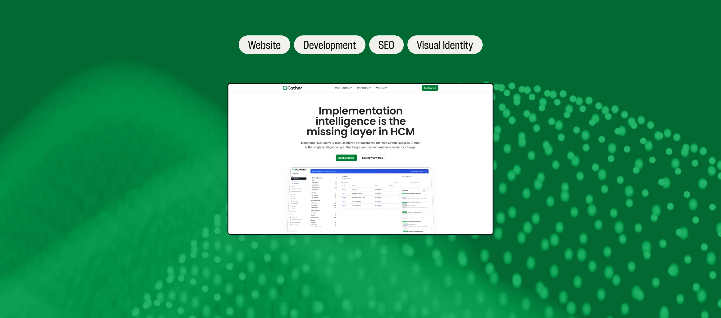
Gather, New Entity HCM’s implementation intelligence platform, was winning interest at conferences and in demos with no website of its own. We designed and built a launch site with one job, turning that interest into a booked demo, and the day after launch it was the first Google result for its name.
Google result for “Gather New Entity”, the day after launch
Lighthouse performance score at the pre-launch check in March
Lighthouse accessibility score in the same check
The client
A product built by the people who use it.
Gather is an implementation intelligence platform for HCM (human capital management) systems, built by New Entity HCM, a specialist consultancy that implements ADP’s WorkForce Suite. Its buyers are implementation teams, consultants and PMO leaders: experienced people who are wary of yet another tool.
In February the team had a conference coming up and needed a landing page for it. We worked with New Entity’s managing partner throughout, with a review call every week.
The brief
A strong product story, with no route to a demo.
Interest in Gather came through conversations, at conferences, in networking and in workshops, but there was nowhere to send people to see a demo, and no way to follow up afterwards. They needed a funnel, and the website was that funnel: it tells the product story and answers a buyer’s questions, so booking a demo is the easy next step.
We started from just a logo, so we designed the visual language ourselves, and the site had to be live before their events.
How we worked
Four phases, one job.
From kick-off in February to launch in late March, reviewed every week with the team, all aimed at one outcome: a booked demo. Each phase turned on a single decision.
-
01Week 1
Discovery
Discovery pinned down what the site was for: the business goal, the product goal and how the two align. We turned that into a site map, gathered the product screens and brand assets, and started a visual design language from only a logo, suited to the type of software and its industry.
Key decision
Pick up where the conversation left off.
Most visitors arrive after an introduction: a demo, a chat at a stand, a workshop. They already know the name. The site’s job is to be the follow-up to that first conversation.
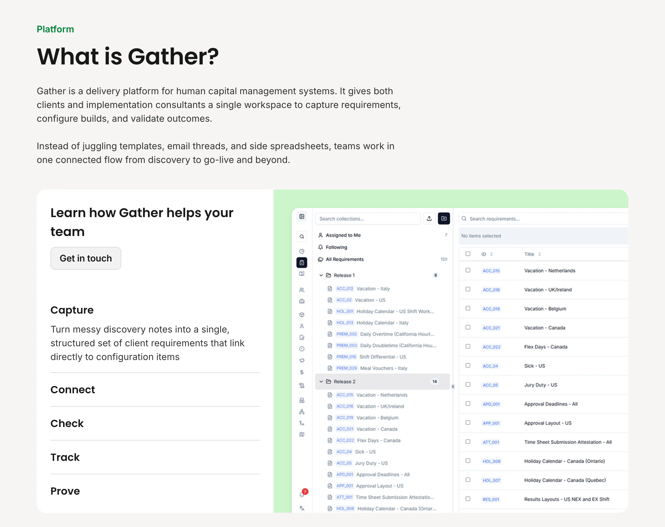
So the site map answers three questions in order: What is Gather, Why Gather and Why now, with the product’s five capabilities (capture, connect, check, track and prove) carrying the detail.
-
02Week 2
Design
We built the identity from the logo and carried its visual design language through every section: its green and black, rounded, product-like shapes, and typography built for readability. We optimised for desktop and mobile interaction alike. What is Gather is an interactive click-through on desktop and stays interactive on a phone, because interaction keeps people engaged and lets a lot of information land quickly.
Key decision
Every button books a demo.
Every visitor arrives with their own questions, and each is ready to decide at a different point. Each section answers some of those questions, so each section carries a call to action: whenever someone feels they have their answers, they can book there and then.
Every button opens the demo calendar directly, and the booking is confirmed straight away. That is unusual for most sites and right for a product landing page, and it came straight out of discovery.
-
03Week 3
Development
After design we built the site with the interactions in place, then ran rounds of feedback on look and feel, motion and copy, alongside the weekly calls, and implemented each one. A pre-launch check scored 100 for performance and 98 for accessibility in Google Lighthouse.
Key decision
Build the interaction as designed. Keep it fast.
The interaction we designed, above all the What is Gather click-through, is what makes the page work, and it is the easiest thing to lose in a build. We carried it through faithfully and kept it fully responsive on every screen.
A small product page has to perform very well to earn its place, so the scores stayed high with every interaction in.
-
04Week 4
Launch
A privacy policy, terms and a 404 page went in, and the team supplied current product screens in light and dark mode. Accessibility was reviewed rigorously, and QA covered every interaction and link before the site went live on 26 March.
Key decision
Launch quietly, get indexed, then share.
The only domain available was the live app’s. We published on gather.newentity.app so the app was never at risk, submitted a sitemap to Google Search Console, requested indexing, and held the social push until Google had found the site.
The next day it was the first result for “Gather New Entity”, so anyone who searched after the posts went out landed on the right page.
-
05The outcome
Ready for the conference
When the team flew to the ADP conference in April to demo Gather, every conversation had somewhere to go: a page that shows the product and books the next demo.
-
06Since launch
A partnership, not a handover
We send the Gather team a traffic report every month. In September we set up Google Analytics and Tag Manager for Gather, scoped so the Gather team owns its data separately from the main firm’s.
New screens and features go into the same sections, so the site keeps matching the product people see in a demo.
The work
Show the product. Then book the demo.
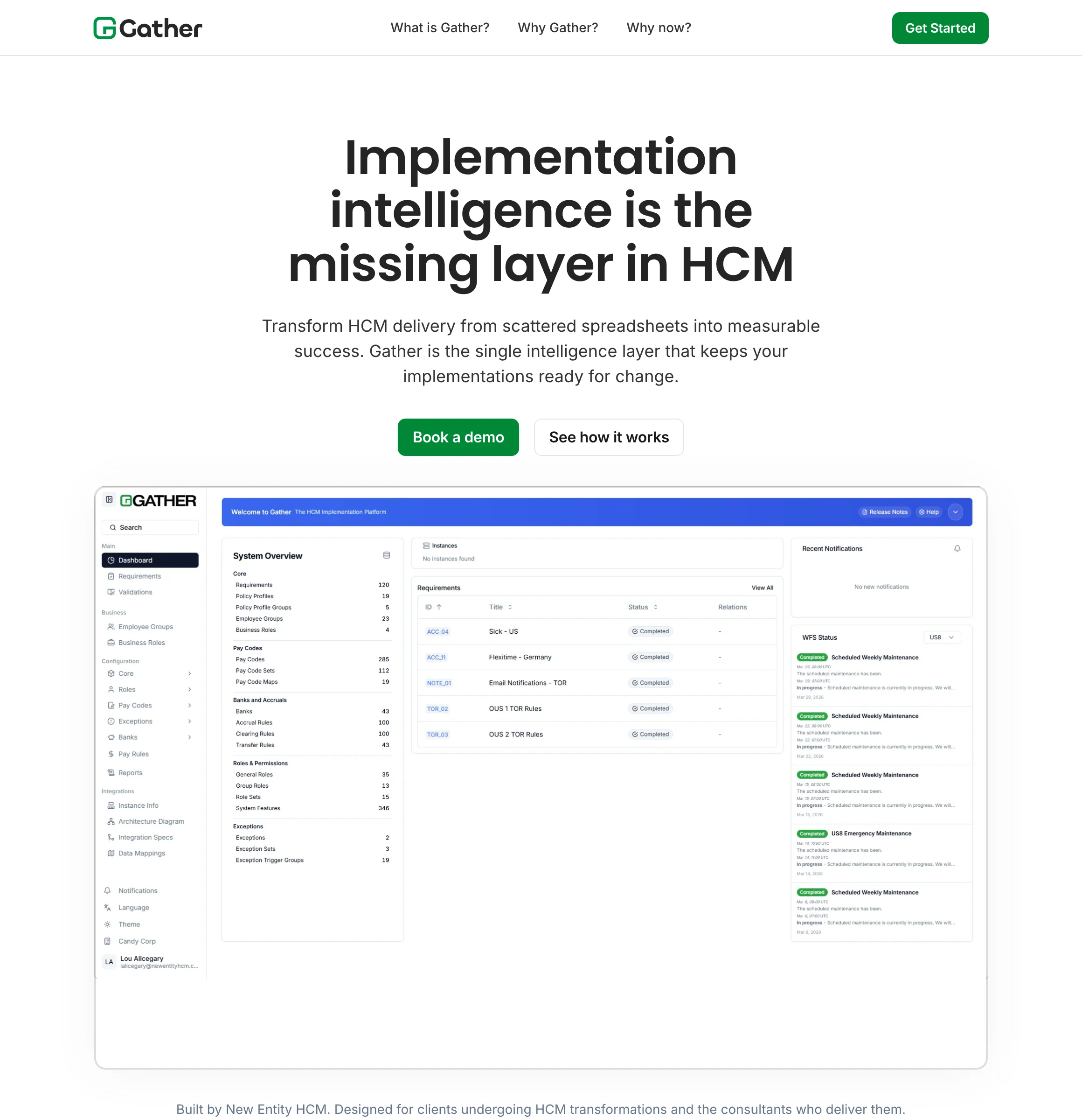
Homepage
The product before the pitch.
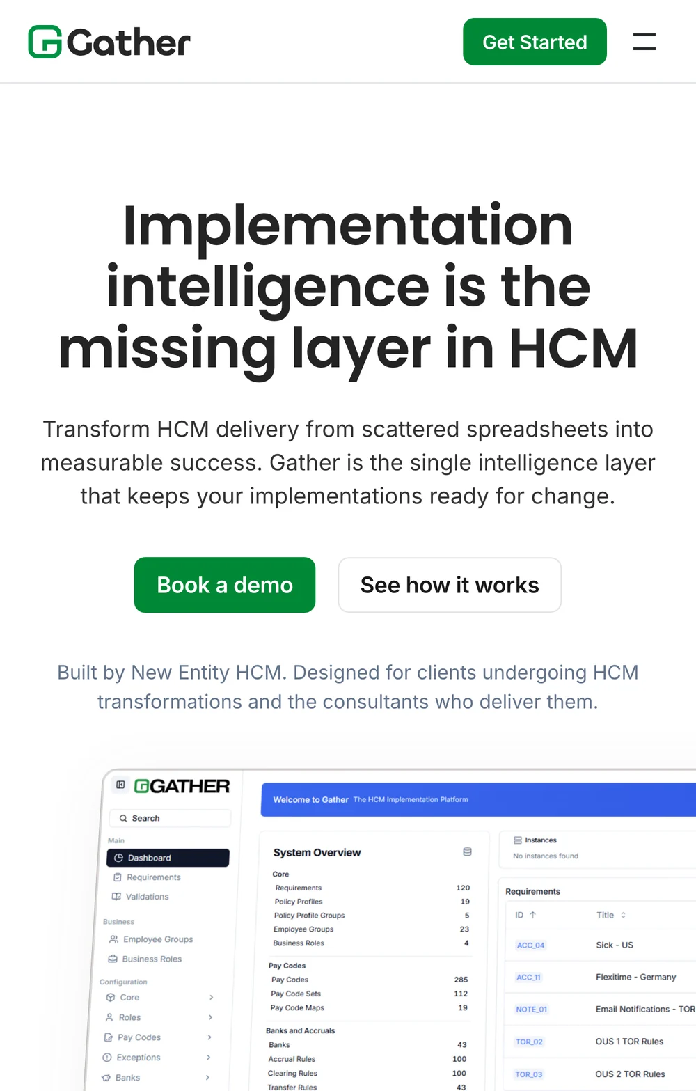
One claim, two buttons and the real dashboard directly beneath, so a visitor sees Gather before reading a word about it.
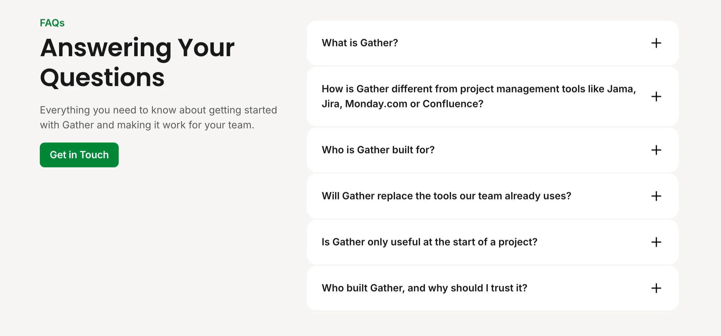
FAQ
The sceptic’s questions, answered.
Six questions written from the buyer’s side, from “how is this different from Jira?” to “why should I trust it?”, with a booking button beside them.
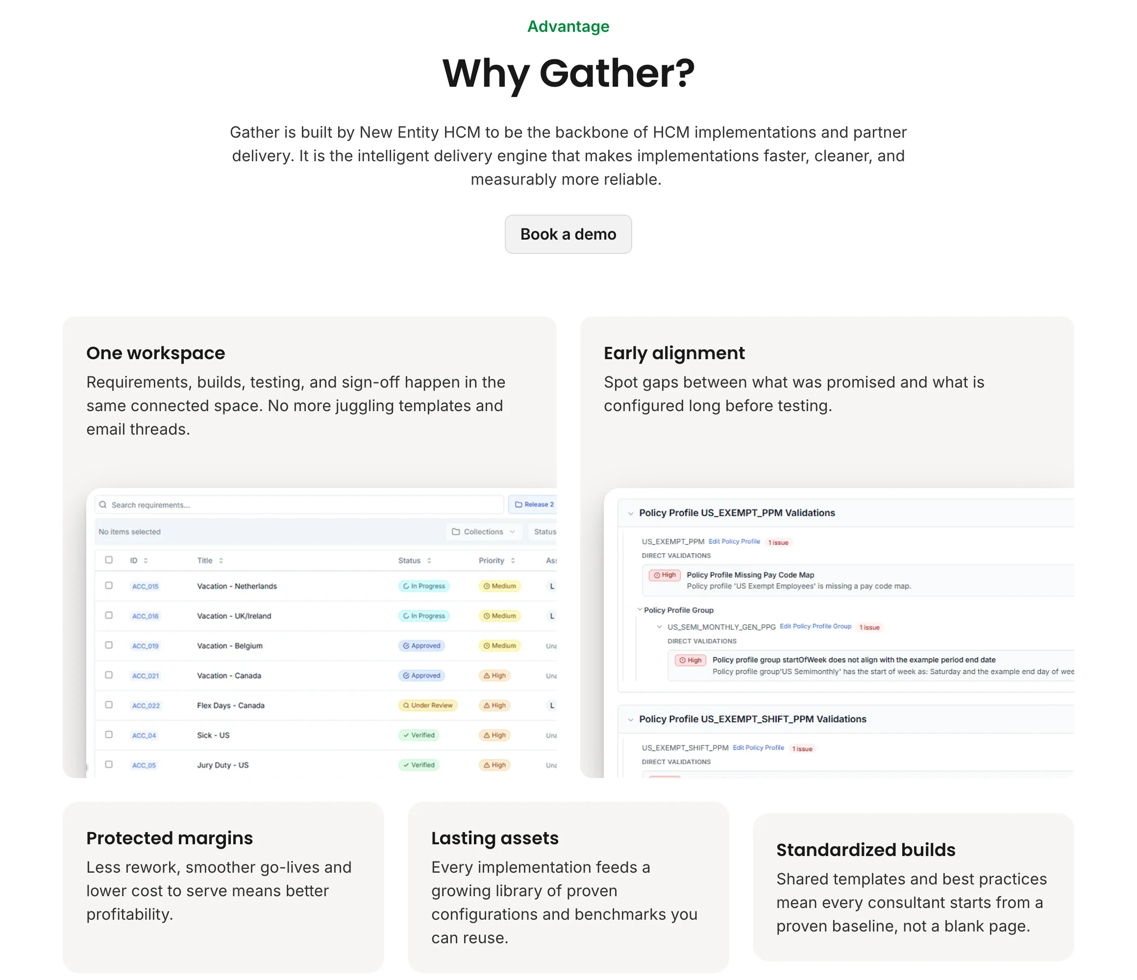
Visual identity
Rounded, product-like, built from the logo.
A bento grid pairs each benefit with a real screen, in the logo’s green and black, with Poppins headings and Inter for reading.
Positioning
Broad pitch, one deep section.
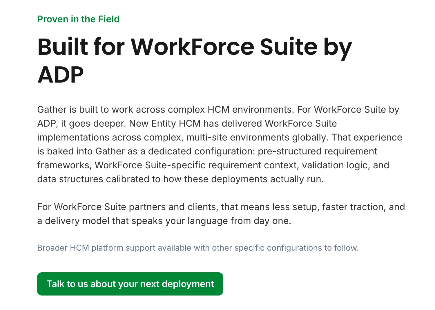
The capabilities speak to any HCM team, and WorkForce Suite specialists get a section of their own.
Mobile
The same story on a phone.
Grids stack, wide sections swipe, and the demo button stays in the header and in every section.
Outcomes
Found first, and ready for the room.
The job was to give every conversation about Gather somewhere to go. The day after launch, the site was the first Google result for “Gather New Entity”.
Before it went live, Google Lighthouse scored it 100 for performance and 98 for accessibility: a fast page, built so every visitor can use it.
It was also the start of a longer relationship. The same team trusted us with the New Entity HCM site, launched in April.
“I don’t see a lot of noise. It seems like there’s very little fat, which I appreciate.”
Lou Alicegary, Managing Partner, US · New Entity HCM